
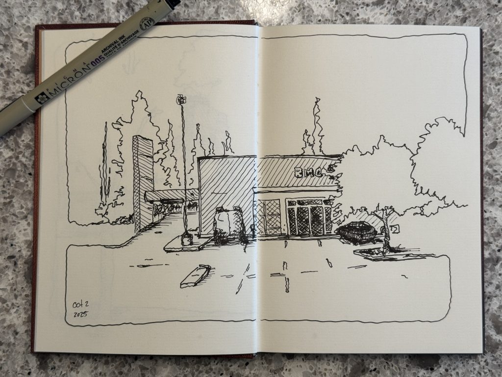
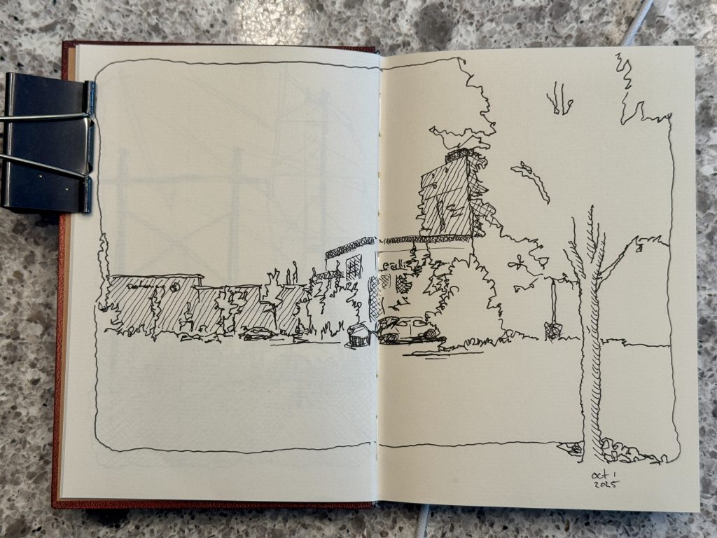
I have a mere three sketches left in this October (sub)urban sketching challenge I set for myself.
Good thing, too. The weather is starting to become a factor to my outdoor sketching efforts. The one rule that I set for my October month of daily drawing was that they were not just doodles of the houseplants. I had to draw some kind of outdoor scene that could be considered suburban sketching or adjacent. I have tried to meet this goal head on by ensuring that there was something “human made” in every scene, whether that was just a park bench or a fence post. Because the problem with the suburbs is that its all mostly single family homes, cookie-cutter shopping areas, sprawling parks and cars.
I also loosely set myself the goal of avoiding when possible drawing from a photograph. The caveat to that was, of course, weather. Sure, I have sat in my vehicle and sketched what I saw through the windshield, but there have been two occasions where the weather was less than cooperative for my efforts and/or I put the sketch off for too long avoiding the weather and I found myself sitting at the kitchen table later on after dark drawing from the photo on my iPad screen. But only twice.
In other words, all these vague and quasi-restrictive rules have done the thing that often drive proper art: conflict with simplicity and opportunity. I made the rules loose enough that I didn’t create so many obstacles that it became impossible to find a subject. I also made the rules strict enough that—as I wrote above—I couldn’t just draw from my couch or kitchen chair every day either. I had to go out. I had to go on walks and find scenes. And when I couldn’t find scenes I had to just draw what I saw.
And that’s the rub, isn’t it.
I went into this combatting another mental obstacle: my inclination to think like a photographer. And photographers want perfect scenes and clear subjects and all those things that seem like they would naturally apply to a good sketch, too. But there seems to be a subtle difference that I just can’t put my finger on—it’s something to do with drawing the mundane and the ability of a pen and ink piece of paper to become something far more interesting than a snapshot. Maybe it is the passing of the visual data through a human brain. Maybe it is the focus of detail through the fingers of a person with feelings and memories. Maybe it is the emphasis that comes from the interpretation that stops being as literal as a lens and a pixel sensor is forced to be by its own nature. Art is subjective not just in the consuming of it, but also in the creation.
A single tree might be interesting enough as a photograph, but takes on a subjective interpretation when the shapes and colours and shadows pass through my eyes, swirl around my brain and shoot out my fingers as pen strokes. It is no longer a pixel perfect image, but an evoked feeling of a tree in that moment.
heavy pen
reluctant as I have been to use heavy pens, I have leaned into fine liners for much of my urban sketching in the last couple years. understanding and becoming friends with strong, bold black ink on the page is a work of confidence as much as it is skill. i am yet to be skilled, but i have learned a kind of confidence in finding the places where solid fills of black ink are not only welcomed but adored when they arrive. i too long thought of my black brush pen as simply lacking the detail of my 005 fine liner and little more than a blunt colouring tool. instead, i have started to see it as important as the page itself: white paper, detailed lines, black shadows, all of it in balance and harmony when drawn right.Don’t get me wrong. Many, many artists aspire to draw photo-realistically and a hundred fold people who are their audience applaud the efforts. I admire such skill.
Yet, Realism in art is just one branch of a towering tree-worth of styles. Not every image needs to be a replica of a photograph.
I’ll give an example that is one step removed from my sketching: I am making a video game. It is artistically best classified as a modern-retro 8-bit game. It is not 8-bit and it is not as simple as that implies. But the art style evokes an 80s arcade aesthetic. It is not trying to be photo realistic. It is not using the best of the best graphics engines to make it look unimpeachably perfect. It is leaning into a style. And while making games that are visions of realism is a fine achievement both technically and artistically, there is more to art, style and creating than replicating the capabilities of another art form.
So here I found myself with a pen, a sketchbook, and a set of manageable rules that forced me to push through tedium, weather, uninspiring architecture and tight deadlines, all while drawing one image a day then letting it go. There was no working towards perfection day after day after day on one work. It was about sketching in the moment and ignoring the inclinations of a wandering photographic mindset.
It has mostly worked. I’m 28 for 28 with three sketches to go as of this writing. My sketches have become freer with style, and my pen become more willing to see a subject where my camera would have seen background fluff. It has been good. And no, not all the sketches are good, but they are exercises that each and every one have obeyed a rule to create an minor obstacle to build a tiny bit of skill in the overcoming of it. And that’s been worth it.
You must be logged in to post a comment.