Category: style

  • urban sketch, two

    Crossposted on Notes for a Sketch

    It’s hardly worth logging a few messy sketches but I will say since declaring that I was going to start a daily art challenge and do a sketch every day… well, I have.

    The afternoon after my last post I made my way to the art store. There are a couple good ones in the city, but I’ve been supporting the place near Whyte Ave called The Paint Spot. It is a pretty typical art store, crammed floor to ceiling with more art supplies, books and toys than one could ever hope to try in a lifetime. 

    I went right back to the corner and bought a couple big sheets of cold pressed watercolour paper. This is the paper we used in the art classes I took and my winter goals include trying to do some regular painting in the shelter of my basement when the temperatures drop. I can break down one of those big sheets into about twenty to thirty smaller canvases, so with a bank of nearly fifty to keep me busy over the winter I should be able to start honing some winter watercolour scenes come December.

    I also made the mistake of walking past the sketchbook aisle.

    Let me be clear. I do not need any more sketch books. 

    I have a medium-sized shelf filled with sketchbooks that are not even close to half-used up. But I do see a new book and get it in my head that, hey, I could use this sketchbook for just that project. You know, like for example, I walked past the sketchbook aisle and I thought to myself: self, what if I bought a book with the intention of using it for practice art? Like, what if I started the book knowing I was going to fill it with half-baked ideas and doodles and experimental stuff?

    That’s the other problem. I stopped buying cheap books. I’ve become one of those artists who buys ahem-quality-cough-cough supplies. That’s great and all, but bougie as that is I then draw myself into a corner of feeling like the art inside those pages needs to match the quality of the canvas. As in, I’ll buy a nice leather-bound sketchbook then feel this overwhelming sense that every picture needs to be good enough to be drawn in a leather-bound sketchbook. It is a bit stifling, to be honest.
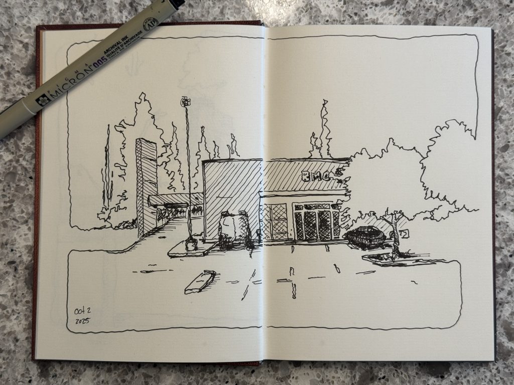
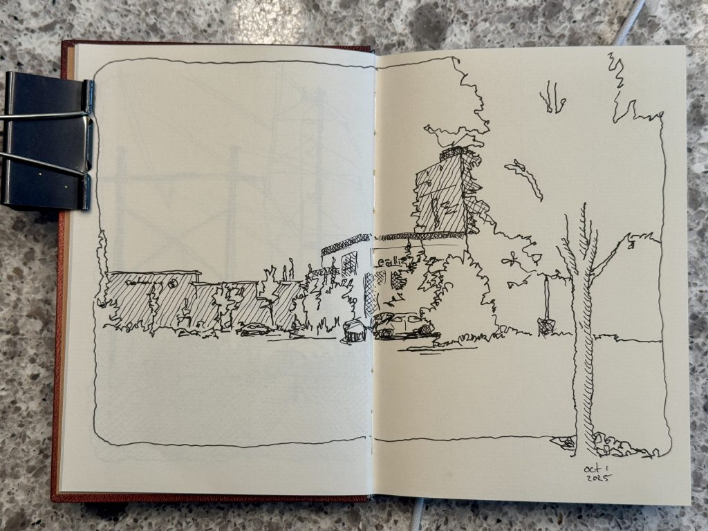
    suburban sketching

    there are no strict rules for what makes and urban sketch, I suppose. one could reflect upon the philosophical nature of an art form that was perhaps conceived as a kind of tourist snapshot art form, visiting a place of architectural urban beauty, a place built by people, and turning it into a sketched scene upon a piece of paper or in a notebook as kind of plein air reference art form. if one lives in a place of cultural significance or often visits those places then urban sketching is a revelatory form of personal expression, finding an excuse to sit for a while and take in a scene, soak it in with ones eyes and translate it to scribbles on a page. my reintroduction to the sport was inspired, actually, by a visit to dublin where I sought out an art supply store so that I could compensate for my lack of planning and find something to urban sketch the city. but if one lives, say, in the suburban outskirts of a small-ish and insignificant city on the canadian prairies where nothing much of architectural consequence exists then one is thereafter reduced to sketching little more than cookie cutter houses and chain restaurants and neatly planned community sprawl. to differentiate that as suburban sketching seems fair.

    So, yeah, art store got a few of my bucks and I bought a nice “practice” sketchbook that I have deemed will be messy and disordered and full of whatever drawings in whatever form I choose. 

    I have drawn in that book four times. 

    And I have drawn in one of my bougie books thrice, contributing there to my daily challenge requirements of a sketchy urban sketch.

    Oh, and you thought art was relaxing, huh?

  • in a theme park.

    As it turns out, Disneyland is not a great place to sketch.

    Oh, sure, it might be a great inspiration for sketching. There are a few thousands of people worth sketching. There is colour and shape and light and shadow and trees and architecture and—deep breath.

    There are also about fifteen places to sit, total. You never really stop moving, and if you do it’s usually because the ride queue is jammed up, and all the best sight lines are meant to be snapped with a camera and moved out of the way for the next person.

    Sketching in Disney kinda sucks.

    But also, it was a bit of a challenge.

    In 2022 we went to Florida and checked out Disney World and I had it in my mind to do some sketching there. When we arrived I started carrying my sketchbook around but then between my unwillingness to be fast and loose and messy, I couldn’t afford (nor would my family tolerate) camping on a bench for thirty minutes to carefully draw a building or a ride or something. So, I started snapping reference photos and (being that we spent a lot of down time at the hotel) I did lots of painting in the evenings from my phone screen.

    loosy goosy

    where photography is about pixel-perfect capturing a scene, and yes, watercolour can be that too when the mood strikes, there is a dream-like element to the flow of water and pigment that can be embraced if one is willing to step away from the seeking of realism. I have been trying to relax my brain in this regard for years, always in a little lockstep with the photographic mindset. “how will people know what I’m painting if the colours/shapes/outlines don’t match??!!” I am trying now to embrace my loosy goosy period, that effort to evoke a vibe or a mood or a feeling from a painting while leaving the literal behind. A bit of shape. A lot of squiggles. A lot of water. A dab of this and a dob of that and just let physics take over. It takes some chill, but it can work out.

    In 2024, just a week ago as I write this, we went to California to check out Disneyland, and I decided, fresh small-format sketchbook in hand and some ripe thoughts about style, that I would experiment. Fast sketches were on the agenda. No sitting. No parking or camping somewhere to draw. Pull out the book and pen and with a maximum (literally MAX) of five minutes, get as much sense of a scene as I could onto paper and—

    Well, I snapped a pic, too, and did all my painting back at the hotel. I wasn’t exactly going to hold a sketchbook open on a rollercoaster while I waited for my washes to dry.

    I did the math and for about 28 sketches I clocked in about six hours total over the week, sketching & painting, and filled front to back an entire Moleskine “small” 3.5×5.5 watercolor folio. Every page, usually double wide.

    The paintings are messy. Some of them I was a little loose on the detail. Some I was a little heavy on the colours. A few got some leakage through the seams of the paper.

    Had I spent even an hour on each of those pics to, you know, make them neater or give them more detail then I would have spent twenty eight hours—two whole waking days—painting everything I painted. As it is, I got it all in between rides and during some hotel siestas. Isn’t that the best way to art, huh?

  • of spring flowers

    It’s been nearly six months since I wrote a note here, and regretfully that means I have passed by many opportunties for noting the slow but methodically forward learning that has happened in the intervening span.

    For example, my spring has been consumed by the most stereotypical of watercolour subject: flowers.

    You know. Close your eyes. Picture a watercolour painting. Now say aloud what was in the image you just pictured. Ninety-three point four percent of you just said the word “flowers” —and you wouldn’t be wrong.

    Early on in my watercolour adventures I told people I was getting into this medium an many of the responses fell into the vibe check of “so—you like painting flowers, huh?”

    I resisted.

    I painted urban sketches. I dabbled in nature scenes. I painted bugs, animals, portraits, snowy landscapes, and autumn foliage. I avoided flowers—mostly.

    Then, my favourite local watercolour instructor, a guy who teaches community art classes in my neighbourhood, offered his spring course selection and it was—yup. Flowers.

    layers of light and colour

    there is a good reason flowers are a watercolour favourite. The medium lends itself well to two particular characteristics of colourful blossoms: light and colour. beautiful flowers are semi-transparent whisps of colour and gradient. beautiful flowers are collections of organic curves evoking hues evolved over eons to evoke our senses. And well-tuned watercolour is the same, watery gradients of semi-transparent colours, layers of hues evoking shape and texture and even accidentally a watercolour abstract is likely to imply something floral. it is almost as though the very medium was invented to solve the human urge to depict flowers as art.

    I relented. I signed up.

    Sure. I meant that me, a middle-aged cis white man who spends his days training for running races and writing science fiction would be spending an entire evening each week in a room full of the type of women who signed up for a flower-painting course at the local community centre. (They’re all creative and lovely, by the way—I’m just the odd duck in the room because all their husbands are at home doing more so-called manly things like changing their oil and drinking beer while they watch the hockey game in their garage.)

    And yet it turns out that painting flowers is probably what I needed to do—at least as a progressive step on my watercolour learning adventures.

    Watercolour flower painting is rife with technique and form in the medium. The delicacy of the subject, the application of hue and tonal value, texture and shadow, transparency and implications of our primal understanding of these shapes, all of it is of vital importance to paint a flower that isn’t growing somewhere in the uncanny valley.

    All of it is vital to becoming a better watercolourist.

    It may be stereotypical, but that is not without ryhme or reason. It is stereotypical because it is like asking if a baker knows the recipe for cake, or if a photographer can shoot weddings, or if a barrista can pull an espresso. Watercolours are turning the world into flowers. Everything is flowers.

    It’s probably not unrelated that this morning I bought myself a summer pass to the local botanic gardens, and need to go pack my travelling art kit.

  • of winter puppies.

    I decided to repaint a picture this morning.

    Back in January of this year I snapped a bunch of wintery pics of the dog while we were out for a walk in the local dog park, a sprawling river valley forest woven with trails and interesting sights.

    A couple weeks after snapping those pics, I drew one. I used it as a reference photo for a sketch. It was a light ink sketch of the puppy standing on the trail then painted with some pan-based watercolours.

    Fast forward. Today I was leafing through my “snow” pictures (since we haven’t got much snow worth speaking of so far this season) and found the same photo and the picture I’d painted from it.

    So I repainted it.

    I don’t think either of these are worth much more than as sentimental paintings of my dog, but objectively I think there is a lot going on in the ten months of time that has passed, me as a (sometimes literal) student trying to improve my watercolour crafts.

    For starters, the depth of shadow that I’ve been able to realize in the latest painting compared to the older one I think changes the whole dimensionality of the piece. In the February version I was really just getting into the idea of using hues and shadows to imply dimensionality painting them in as a layer after the initial colouring, but often I did this in a way that was almost cartoon-like. For today’s painting, I actually started with the shadows. I painted a very pale wet-on-wet sky, then uses some wet-on-wet shadows to build the background layer of trees. As the painting began to dry I added additional tree layers building them up across at least four, maybe five different stages and then at the end when it was almost completely (but not quite) dry adding the final dabs of dark that imply the shrubbery at the front.

    The dog herself is almost entirely shadow. Wherein the February painting I had started (probably started the whole sketch in fact) with a crisp outline of the dog, in the December version she started out as a couple of wet blobs of pale paint. Rather than colour her as I see her, I ignored browns and reds entirely (which is what colour she actually kind is—the colours in the earlier work are definitely more accurate from a hue perspective) in today’s painting I focused entirely on the tonality of her patches of fur and the shadows around her eyes and ears and legs. In the end, if you asked me which one looks more like my dog, I’d one hundred percent say the December painting.

    repainting the paints

    I was watching an online painting course this weekend and though the material didn't offer much in the way of technique that I hadn't seen from other places a dozen times before, it reminded me that repetition is not only okay, it's actually a great way to progressively improve what you are doing. I often find myself in the mindset of the one-and-done artist, thinking oh, I already painted that, what's next? But in reality, painting the same thing two, three or many multiples of times means that you can step away from the final result and focus on other aspects of the creation of that art: trying different colours, brushes, techniques, etc. It sounds obvious if you already do this, but personally I need to give myself more permission to try things more than once.

    As 2023 and December draw to a close, and I enter into what will be my third calendar year of watercolour I know that much of the improvement I make day by day will start to plateau and become less obvious. I want to spend the next year focusing on technique and building up a style and being able to create art that makes people say “wow!” and so I think the first step in that is making myself say wow… an act that often comes from the ability to put your own self-critical eye against something that so clearly contrasts. Looking back on your old work (particularly as a student, still learning everyday) is one such way I think I’m going to be trying to a lot more of next year.

  • of winter skies.

    I decided in later October that I was going to write here more—and then promptly October turned into November and November is a month when I do a 50,000 word novel-writing challenge and that consumes hours of my day, each day, and leaves very little time behind for either art or writing about art.

    But it’s December now.

    And I’m still busy trying to bring that novel from about fifty-eight thousand words to a conclusion at about eighty-thousand words, but December is not about speed writing so much as settling into a winter routine, so I’ve been writing a bit each day and then painting a bit each day and, y’know, living the artsy-fartsy dream.

    Plus, I bought a new wide flat brush this month and in just a few days it has proven to be a magical tool for making incredibly vibrant skies of winter and sunlight.

    So, in December I expect to do a lot more art. In fact I hope to do so much art that in January I am compelled to restock my watercolour paper.

    Now that’s a resolution, huh?

    gouache starlight and snowflakes

    I had this silly notion in my head of being a watercolour purist, of using strict techniques to paint because I thought, wrongly, that I might get judged for not following the rules of painting, and hey, for all I know I still am following those rules by digging out a tube of titanium white gouache (instead of proper watercolour paint) and speckling my sky with starlight or snowflakes or lens flares or whatever it is that you want to interpret those little white points in the painting to be, but I like how it looks, and I don't think that rules are meant for anything but a baseline anyhow. I load a bit of wet white gouache onto my brush at a certain point in the painting process, sometimes it's after the sky has dried and sometimes it's after the whole rest of the painting has dried and once it was when things were still a little wet and I wanted to see the effect of the still-wet sky on the drips of white and you know what? it turned out kinda cool, too. So I've been ignoring that silly notion this month and just painting a lot of white dots in the sky, splattering my otherwise flat art with the chaos and randomness of white speckles of starlight or snowflakes, against the rules that might not even exist anywhere but my own head.

    I used to make skies an afterthought. In fact, when you are urban sketching (at least I have found) you get so caught up in the urban part, the sketching of buildings and architecture and people, that you tend to get to the end and say to yourself “oh, right, what colour was the sky again… here’s a dab of blue and let’s get on with it.”

    But painting imaginary winter scenes I’ve been following the approach modified from what I learned in that class I took last spring which is simply to build up from a sky. The whole thing is a sky. The world is basically just blocking the sky. Even the ground. The ground is just in front of more sky. The whole earth after all is a sphere and if you are on that earth painting a watercolour picture (which I think includes all watercolour pictures ever painted in the history of watercolour) there is a spherical orb of sky surrounding you in all directions and sure… the ground blocks a lot of it, but you really can’t go wrong painting a sky and then just going from there.

    So that’s what I have done.

    I’ve painted a lot of skies, using lots of deep blues and vibrant oranges and magical yellows and speck of white. And they all turn out in a way that I am starting to love.